Tuesday, October 27, 2020

Director’s Cut

Many movie buffs love it when a favorite movie can be seen as the director saw it. These so-called “director’s cuts” sometimes show the original intent of the director before the producer or movie studio or marketing got a hold of the film and made changes they thought necessary. 


Recently, one of my publishers, Houghton Mifflin Harcourt, returned the rights to some of my books which had gone out of print. I decided that I would republish some of these books and take the opportunity to make a few changes. I have called these books “author’s editions.”  


Some of these changes involved a word or two here and there. Others transformed the design of the book either to reflect what I had originally intended or what I now feel the book should project in terms of theme and mood. 


Still others involved correcting some illustration that had bothered the heck out of me after it was printed. You know what I mean, if you are an illustrator—an unintended line that marred a facial expression, a fold in a shirt or pant leg that suggested an undisclosed deformity, a missing line that if replaced could embolden the image. 


Finally, because I intended to publish my books through Amazon’s Kindle Publishing Direct, I had to change all “landscape” books to “portrait” and make judicious cuts to illustrations and reinterpret page layout.


For my 2007 edition of Beowulf, A Hero’s Tale Retold, I decided to redo the backgrounds. Back then I didn’t know how to piece together a background design in Photoshop. I had to go with a blown-up, rather blurry, background from one of the illustrations.


Now I have just the design I had intended to use behind the illustrations and the text.


Also, I didn’t know, or it never occurred to me, that I could change the coloration of an illustration to reflect the mood I wanted to portray. The original illustrations were all done in green, but after thirteen years I realized that they didn’t all have to be green. Some could be tinted blue, others tinted orange. Photoshop, and years of experience, allowed me to do this.


For the Houghton Mifflin edition of Chee-lin, I had made complicated backgrounds on my computer, which I thought went well with the illustrations. But last month, I decided that the backgrounds had to go. Wouldn’t a simpler page layout enhance the illustrations and set them off as they should be?


For my first book, The Cloudmakers, I made only minor changes. I added a cloud design to the pages and changed the illustrations from landscape orientation to portrait. I also fiddled with the anatomy of the figures. Heads were correctly seated on shoulders. The boy’s shoulders became less manly, etc. I had to restrain myself and not make too many changes. After all, this was my first book.


And finally, I have been able to make changes to the covers. As I said in a previous blog ( May 31, 2016), covers have always been hard for me. So for Chee-Lin, instead of


we now have:


And for The Black Orchid Code, we see the original 2014 cover and the newly conceived one::::


These author editions are fun to do. They give me the opportunity to revisit old work and make improvements. They also let me return to that moment in the past when I first created the book, when I was excited about the project, when I was inspired.


Sunday, November 13, 2016

Each Time Again

A couple of summers ago I wrote a poem about peace called "Each Time." I posted it here (October 20th and 26th, 2014) and on my Facebook page. Since then the poem has been translated into a dozen or so more languages—thanks in large part to Olga Pastuchiv, who speaks a number of languages including Ukrainian and Russian and Greek.

Olga has enlisted the help of her many friends to turn my words into languages as diverse and Basque and Albanian, Norwegian and Estonian. For anyone who likes languages as much as I do this is a real treat. But these translations go beyond any satisfaction I might feel at seeing them, scrutinizing the words, wondering what it would be like to speak these languages, going to the places where they are spoken, widening my view of the world. They go beyond this because, the poem is a quiet call to peace. It asks that peace start with the individual seeking it.

In the wake of Tuesday's election, with an uncertain future stretching far ahead of us, this poem becomes more important than ever. Here is the link to a pdf. of the translation done so far (January 2017).

https://drive.google.com/file/d/0B3kSX9XzJ8VBdGd4czdRbmRHV2c/view?usp=sharing

My debt to Olga is immeasurable. Here is a brief look at her work and a link to a website about a mural she and a friend did.


http://curtiscreativespaces.com/childrens-art-curtis-butterflies-of-maine-mural/


Olga and I have discussed via email how wonderful it would be to get artists to represent their language by asking them to illustrate the poem according to their understanding of the words. Maybe some day this will happen, but for now, I have simply repeated the simple illustrations I did for the poem.


Thursday, June 16, 2016

You Never Know

A corollary to “Why Not?” in my April 17, 2016 posting is “You Never Know.”  You might as well do it because you never know where your efforts may lead.

So, with this in mind, last week, I decided to put up three more books on Amazon in a print-on-demand format. Each book has, I think, a “you-never-know” feel about it. Perhaps the book will take off. 

The first one is is a color version of my companion guide to From the Good Mountain. You can find out more about this book on my website here: http://jamesrumford.com/goodmountainguide.html. 


Why go to the trouble of making a color version? It isn’t as if people interested in making books in the fifteenth century are beating down the door to get a copy in black and white. No, not that at all. It has happened that a Korean publisher has purchased the rights to translate the book into Korean and, what is more, the publisher would only do it if the book were in color. So, with an attitude of “why not?” I sent the digital color files to Seoul. Who knew that Koreans would be interested in this book? Then I thought: who knows? Maybe English speakers might also be interested in a color version.

Here are a few pages from the color version. Yes, it is a bit more expensive, but you never know. Maybe it will attract more customers.


The next book I made available on Amazon is Mango Rain. I tried and failed to get American publishers interested in the book. So, I translated it into Portuguese and sent it to a publisher in São Paulo, Brinque Book. After ten or so years, the book is still in print and doing quite well. It won an award and is part of the school curriculum. 


Mango Rain is about creativity. It tells of a little boy named Thomas who spies a bottle cap on a ground. Such an insignificant thing, but to Thomas, the bottle cap blossoms into an idea: Thomas will make his own toy car. The book draws on the metaphore of a mango tree. As the tree blossoms and bears fruit which slowly ripen in the hot African sun, Thomas collects what he needs, and with the help of his father, builds a toy car.  

This Thomas is the same Thomas many American children have already met in my book Rain School, now part of many school curricula. 


So, maybe my publishing Mango Rain, in English may attract many of the same readers. You never can tell.

The last book is Kahalaopuna, a traditional Hawaiian story of pono righteousness and aloha mercy. It tells of a beautiful maiden and her jealous suitor. In this Othello-like tale, the suitor winds up as part of the ridge on Mānoa Valley’s southeast side. I can see his outline from my kitchen window.


In 2001, I turned the traditional tale into an illustrated children’s book as part of the efforts of the residents of Mānoa Valley to prevent the electric company from erecting huge high-tension poles on Wa‘ahila Ridge. The sale of the book was to help off-set the legal costs involved in confronting Hawaiian Electric. In small part because of the book, in large part because of the efforts of the people of this valley and of the organization Mālama Mānoa, Hawaiian Electric decided to forego installing the poles.


A few weeks ago, a church in the valley asked me to come and read my story (which I’ll do tomorrow). They were disappointed to find out that the 2001 book is out-of-print. Last week, I decided to make it available once again. This time I turned it into a bilingual book, fixed up some of the images digitally, and put it up for sale on Amazon. I thought, once again, why not? And besides, I can’t know where this book will take me next.


Tuesday, May 31, 2016

Covering Bases

Making a cover for your book is one of the hardest things to do. A cover is like clothing. How many times have you said before some important event, “What am I going to wear?” You know you want to make a great impression, but you don’t know what will do the trick.

Covers, too, need to make a lasting impression. They need to do the trick. But how? My goddaughter Emma Rose, who’s in elementary school, had some pretty right-on criticisms of the proposed cover for her mother’s new book. Here’s what she said:

  • Okay. That part's too dark. 
  • That photo is over-processed. 
  • Why is that font so fussy? 
  • Why didn't they use the whole space on this part—what's all the white space about? 
  • And this section over here? Bor-ing. 
  • This background needs to be lightened up, because you can't read the type over it. 
  • Too many different fonts. 
  • This one looks like they typed it in an office. 
  • This one is very good. 
  • No no no no no.
  • This one will be good if they move the title up more so it's not covering the town part of the photo; it should be covering the sky….


Okay, let’s consider what she said.

Dark covers don’t appeal to people, especially to children, who, it seems—and I got this from a librarian friend—always head for the light, bright book.

Book covers need to be clear in their message. The images shouldn’t be overworked, and the typeface shouldn’t be too fussy nor should there be too many different faces [fonts]. One face or two is all you need. 

The cover, of course, can’t be borrrrrring. But what does that mean? It probably means that there is something mysterious on the cover. It might mean that there is a comical illustration. It might just be that there is a nice, friendly person or animal on the cover. Scary is good, but not for all ages.

Don’t let the type cover up the image. After all, it is the image that will sell the book. In fact, it seems that one overriding factor for a children’s picture book is that the image and the message it conveys be seen from across the room. Like a magnet, the image has to draw the kid in and get the little reader to open the book.

Consider the overall design. By this, consider the negative space, the “white space,” as Emma Rose puts it. Make sure that there is a balance between what is there and what is just plain background.

To Emma Rose’s comments, I might add a few questions you might ask yourself about the cover you’ve just come up with:
  • What part of the book does the cover show?
  • Does the cover tell you what kind of book it is?
  • Does the cover show the best part of the book?
  • Does the cover promise more than the book actually gives?
  • What is the order: author then title or title then author?
  • What stands out the most, the title, the author, or the image?
It is, let’s face it, easier to criticize whether constructively or destructively a cover. What is difficult is to come up with a cover out of thin air. Creation is…well…like the Big Bang. It starts with nothing, gets super heated, and expands at an alarming rate. Before you know it, you have too many ideas and you are faced with too many choices. 

What to do?  I suppose that the best advice is to keep it simple. Instead of trying to cover all of your bases and tell everything about your book with your cover, just settle on one idea. If your idea is appealing, the reader will open the book, guaranteed.

I can’t say that all of my covers have been successful. In fact, I’d say that some of them are fairly dismal. Had Emma Rose been standing by my side, she might have pointed out some fairly obvious booboos. But, I hope that with the above, you might form a checklist of do’s and don’ts.

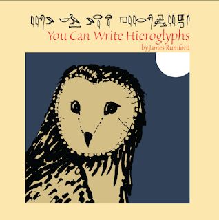
Here’s the first attempt of a cover for my next book You Can Write Hieroglyphs


At first I thought my cover looked cool . . . and mysterious. (I wonder what you think.) But then I thought about the “rules” about keeping the cover light-colored and kid-friendly. Besides what was so enticing about gold hieroglyphs? And what did this have to do with the contents of the book? Finally, who were my readers? So I scrapped my first cover and came up with this:


When I got the proof back from CreateSpace, I realized I still hadn't followed the "no-dark" rule. So I lightened the owl. For now, unless I think of something better, I am sticking with this cover. 


I’ve published You Can Write Hieroglyphs through my Mānoa Press. (You can get a copy here: http://www.amazon.com/You-Write-Hieroglyphs-James-Rumford/dp/1891839268/ref=sr_1_1?ie=UTF8&qid=1464723575&sr=8-1&keywords=You+can+write+hieroglyphs ) I want the book to be a follow up of my Seeker of Knowledge, about François Champollion’s decipherment of ancient Egyptian, which I published through Houghton Mifflin over fifteen years ago.

You Can Write Hieroglyphs was inspired by Kurt Wiese’s 1946 Caldecott Honor book, You Can Write Chinese, a book which I loved as a second grader. 

I remember refusing to go to bed until I had copied all of the Chinese characters in the book. Here is one of the pages I copied that night:


Although Wiese’s book is terribly out-dated, it did something magical: it inspired me to spend a lifetime learning Chinese. We authors should all be so lucky to have written a book with that kind of power. 


And one more thought: did Wiese’s cover draw me in? I don’t know now. Something, though, got me to check the book out and take it home from my school library.

As for my You Can Write Hieroglyphs, here below are a few sample pages. I'm just betting there will be some kid out there that, like long-ago me, who will delight in the beauty of these hieroglyphs, copied after a scribe who lived centuries and centuries ago.


Sunday, April 17, 2016

A Long Time


It’s been a long time. I guess I was lazy or bored or both. Probably I just forgot how much time has really passed since my last posting. At least, I’d like to blame my absence on the fleeting passage of time.

But a few weeks ago, I dusted off a few manuscripts in my desk and decided to publish them myself—print-on-demand-wise. I guess I finally realized the power of ‘why not?’

There are so many obstacles in one's way, so many powerful excuses, so much procrastination in life; yet like some bully you finally tell off, the obstacles, the excuses, the mañanas vanish with two simple words: ‘why not?’ Why not publish those manuscripts? Why not tell people about them in this blog? Why not redo your website so that these new books have a prominent place? 

And so, here is an introduction to four new books from my Mānoa Press. You can find them on Amazon. Just paste the title in the search box. The books are $12.50 or less. [Click on images to enlarge.]


The first book I want to tell you about is Miss Margaret, Cat Magnet [$9.75]. The germ of this book began many, many years ago, when my wife bought a patchwork doll made by Sonja Hagemann of Hale‘iwa. The creator had stuck a cloth cat to the doll. I was fascinated and wondered what it would be like if a girl had the power to attract cats just as a magnet attracts iron. It took several years to come up with a story. When I did, I had to bring Margaret to life in a drawing, but I liked nothing I did—until I met Pamela Telford of Maui. Her flowing, red hair stopped me dead in my tracks, and I went home to find a red-haired Margaret smiling from my drawing board.


Book two is very, very different from the whimsical nature of Miss Margaret. In Bright Star [$12.50], we meet an African king named Njoya [en-joy-ah], who lived a hundred years ago in the grasslands of the modern African nation of Cameroon. 


This book, too, began many years ago, as I was working on my book about Sequoyah, the Cherokee man who invented writing for his people. That book was published by Houghton Mifflin and was honored with many awards. As for Bright Star, I could find no publisher for it. Africa is too far away, too complicated for most publishers. It is hard for them to understand what happened there a hundred years ago. As for readers of such a story about an African king, where would they come from? I would like to think that such readers exist. After all, Njoya was unlike 99.9% of all the people who have ever lived. He was a Peter the Great, a George Washington of sorts, a man who understood his people and saw their potential. He stood up to colonialism in a way that made him more powerful than any rebellious leader, any guerrilla fighter or terrorist with a mass of weapons. He had but one weapon, his dignity and his belief in his people.


The third and the fourth books are a re-publication of my second children’s book about Polynesian navigation, The Island-below-the-Star, which came out in 1998. The remake is called: Island below the Star [$12.00], for which there is both an English and Hawaiian version. The new edition contains a star map as well as a series of maps so that the reader can follow the progress of the five brothers as they make their way up from the Marquesas Islands in the south to Hawai‘i. To find out more, see my website: 


In the coming months, I hope to dust off many more of my manuscripts and get them out there. After all, why not?